AVA BELL ROYA
Project Challenge:
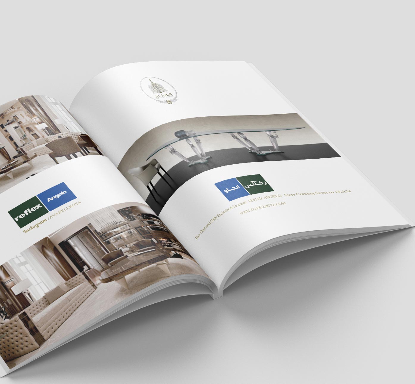
AVA Bell Roya Company is the official sales agent of luster and interior decoration equipment manufactures by luxurious brands such as Lalique-France and Reflex-Italy, etc., in Iran. Management of the company started officially one’s identity projects thru concluding for logo and corporate identity design contract with me upon the establishment of the company. At the beginning of the project, the main challenge of the project was the client’s request for integrating the activity field of the company with the nature of its name.
“AVA” in Persian means tone and sound and “Bell” means urceolate in English). For the first point of view, integrating the symbol of tone and sound with the figure of luster or lighting equipment was impossible because they were two irrelevant and non-reconcilable facts.
Strategy/Methodology:
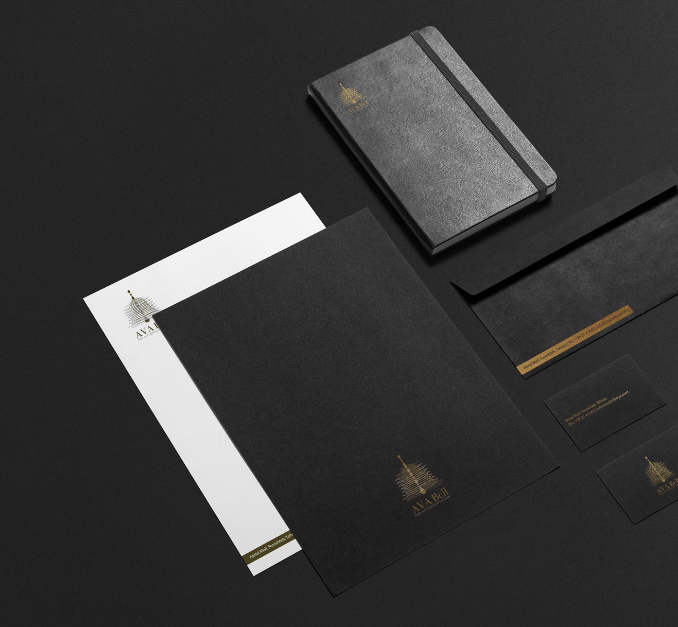
AVA Bell Roya Company is a commercial company in the field of importing luxurious interior decoration products especially high-end lightnings in Iran and preserving the luxurious nature of the corporate besides its field of activity was highly prioritized.
I; at the beginning of project, thru large scale search of companies with the same activity of AVA Bell Roya company in the fields of production and sales agents of the mentioned products, founded that most of the companies used luxurious styles in design of logo, official papers, and other marketing and advertising projects and used aristocratic symbols and luxurious marks.
Since AVA Bell Roya company works as the official agent of brands including Lalique – France and Reflex-Italy, etc., I visited the official sites of these companies and affiliate sites for acquiring more information and founded a highly intelligent harmony and combination in the collection of their graphic design projects of those companies and their affiliate websites.
This fact caused me to decide to inspire the style of design and combination of designs and colors in the graphic projects of AVA Bell Roya company from the mentioned brands so that I could to draw corporate identity of AVA Bell Roya company to that style.
Solution/Contribution:
According to the idea of many of critics and colleagues in branding field and also the client which helped substantially in better performance of project y their comments, the final design and its essentials (official papers), the main challenge of the project i.e. two parts of the company’s name (AVA and BELL) were integrated perfectly in the final design and the client was fully satisfied.
Also, luxuriousness nature of the company along with the blending concept of the company’s name made a high percentage of people mention the nature of a bell symbolizing a lightning.
Results/Impact:
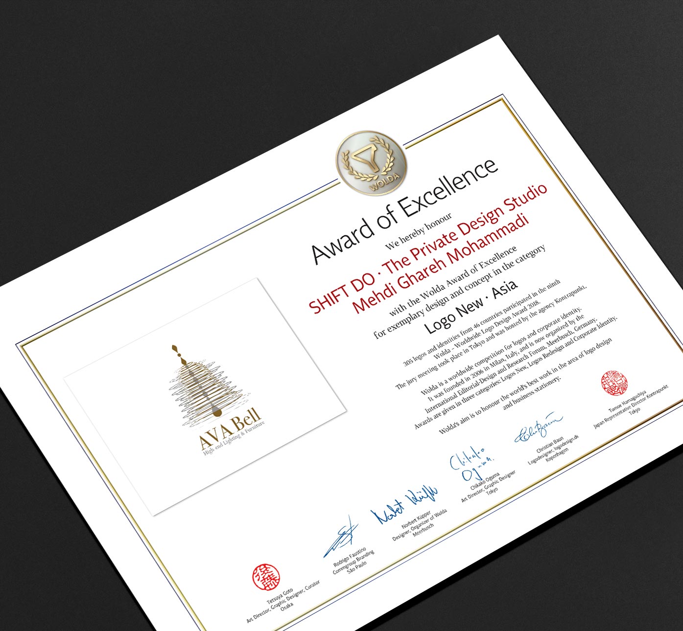
Completion of design project and preparation for implementation and printing was coincident with the last opportunity of participating in one of the greatest and well-known international logo design competition named WOLDA which might be the best chance for introducing this brand name internationally. Finally, by the nomination of AVA Bell Roya Company’s logo in the competition and upon review by the members of the arbitrators’ board, the company’s logo achieved the award of excellence prize of the competition.
According to the client’s comments, this project was the sole successful and complete project they experienced during their work record and acknowledged this fact thru overpayment for contract remuneration.
Now, AVA Bell Roya Company is one of my most loyal clients for its success and satisfaction in the project of designing the logo and its essentials.